A+ Content vs Premium A+ Content: What You Actually Get
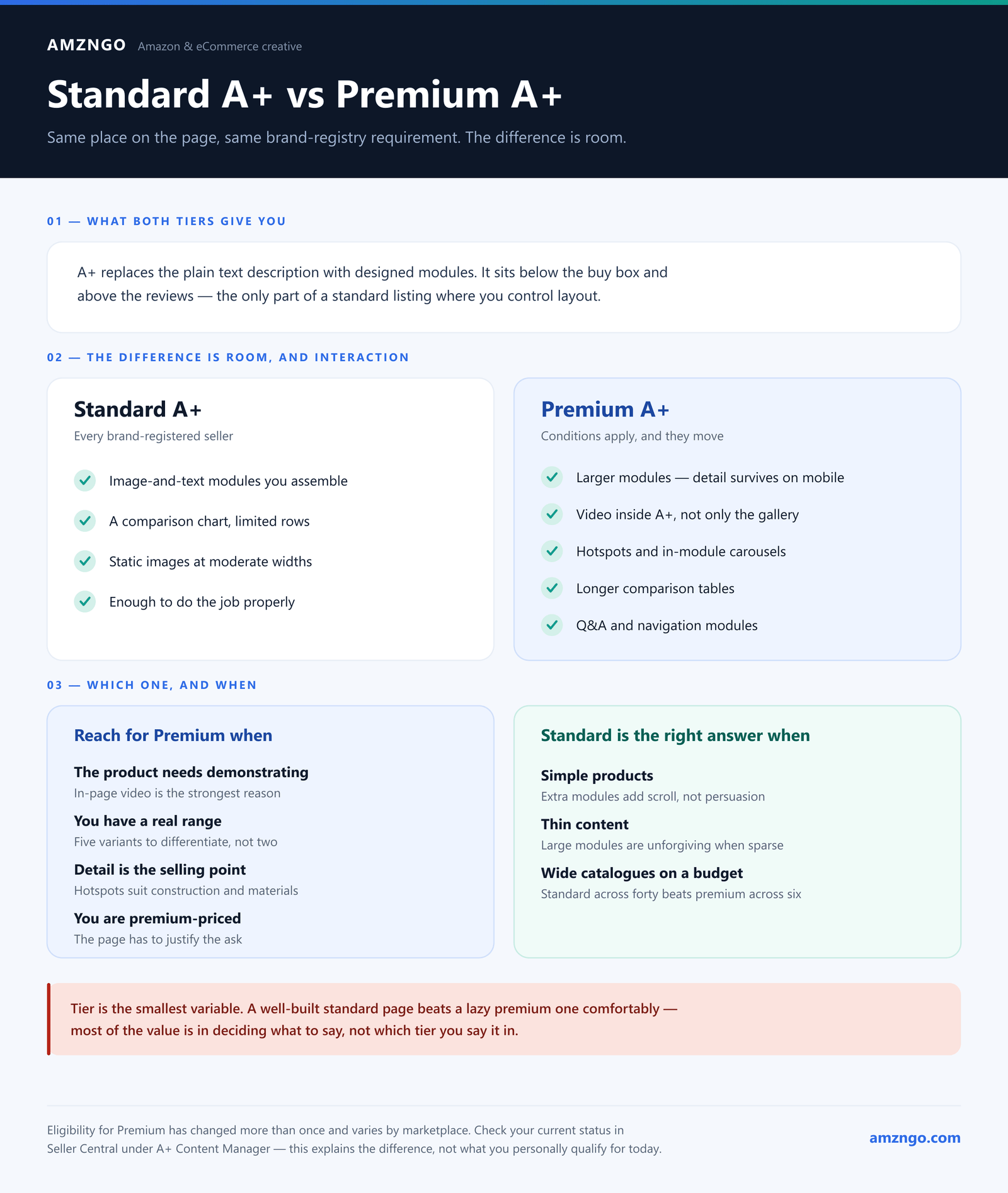
Both sit in the same place on your product page. Both are only available to brand-registered sellers. The difference is how much room you get to work in, and whether the buyer can interact with what you built — which matters more in some categories than others.
Eligibility moves. Premium A+ started as an invitation-only paid tier, then Amazon opened it to brands meeting certain conditions at no extra cost. The conditions have changed more than once and vary by marketplace. Check your current status in Seller Central under A+ Content Manager before planning around it — this page explains the difference, it does not tell you what you personally qualify for today.
What both give you
A+ content replaces the plain text product description with a set of designed modules: image and text combinations, comparison tables, banners, feature lists. It sits below the buy box and above the reviews, and it is the only part of a standard listing where you control layout rather than filling in Amazon's form.
Amazon's own guidance is that A+ content can lift sales. In our experience the clearest effect is often on returns rather than conversion — A+ is where sizing, compatibility, materials and care instructions get answered properly, and those are the questions that produce a bad purchase when they go unanswered.
Standard A+
- A library of image-and-text modules you assemble into a page
- A comparison chart, typically limited in the number of products and rows
- Static images with text, at moderate widths
- Available to every brand-registered seller
Standard A+ is enough to do the job properly. A well-built standard A+ page beats a lazy premium one comfortably, and most of the value is in deciding what to say, not in which tier you say it in.
Premium A+
Premium adds room and interaction:
- Larger modules — noticeably wider images, so detail survives at mobile sizes
- Video inside the A+ area, not only in the gallery. This is the big one for products that need demonstrating
- Interactive elements — hotspot modules where tapping a point on the image reveals a detail, and image carousels within a module
- Longer comparison tables, useful if you have a real range to differentiate
- Q&A-style and navigation modules that let a long page be scanned rather than scrolled
When premium is worth the extra work
It is not automatically better. Premium modules take longer to design and require more content to fill without looking sparse. Reach for it when:
- The product needs demonstrating. Anything with a mechanism, an assembly step, or a before-and-after. In-page video is the single strongest reason to go premium.
- You have a real range. A longer comparison table earns its place when there are five variants a buyer must choose between. With two products it is padding.
- Detail is the selling point. Hotspots suit products where the value is in construction — stitching, materials, engineering — that a wide shot cannot show.
- You are premium-priced. If you are asking more than the listing next to you, the page has to feel like it justifies that. Production quality is part of the argument.
When standard is the right answer
- Simple products. If it is obvious what the thing is and does, extra modules add scroll, not persuasion.
- Thin content. Premium modules are large and unforgiving. Half a page of substance stretched across them looks worse than the same content tightly done in standard.
- Wide catalogues on a budget. Standard A+ across forty listings beats premium across six. Coverage compounds; a single beautiful page does not.
What actually decides whether either one works
Tier is the smallest variable. What decides it:
Answering the real objection. Every category has one question that kills the sale — fit, compatibility, safety, assembly difficulty. Find yours in your own returns and in your competitors' one-star reviews, then answer it in the first module rather than the fifth.
Designing for the phone. Most of your traffic is in the app, where modules stack and reflow. Text that is comfortable on desktop routinely becomes unreadable. Check on a device.
Not repeating the gallery. A+ that restates the listing images wastes the one section where you can explain rather than assert. If a module could be swapped with an image slot without losing anything, it is not doing its job.
Writing to be skimmed. Almost nobody reads A+ linearly. Headings should carry the argument on their own, so someone scrolling at speed still collects the three things that matter.
The short version
If you qualify for premium and have the content to fill it, use it — particularly for in-page video. If you do not, or your product is straightforward, standard A+ done properly will not hold you back. The tier has never been the reason an A+ page failed.
Not sure which your catalogue needs?
Send us a listing and we'll tell you whether premium would change anything for that product — including when the honest answer is that it wouldn't.
Ask usMore on our A+ content design and Brand Story work.