











A+ is read by people who nearly bought
Nobody scrolls past the buy box out of idle curiosity. By the time someone reaches your A+ modules they are interested and something is holding them back — which makes this the highest-intent surface on the whole listing, and the one most often filled with a founder's story and a photograph of a warehouse.
The useful question is not "what do we want to say" but "what is the last thing standing between this person and the button". It is almost never brand values. It is fit, compatibility, durability, what happens if it breaks, whether it works with the model they already own, and how it compares to the cheaper one they were also looking at.
Answer those in the modules and two things follow: more of them buy, and fewer of the ones who buy send it back — because returns overwhelmingly come from expectations the listing set and the product did not meet.
The comparison chart earns its place
If we could keep only one module it would be the comparison table against your own other products. It does two jobs at once: it stops a shopper leaving to work out which of your variants they need, and it moves people up your range rather than down it.
It also quietly handles the competitor question. A buyer comparing you to a cheaper listing is looking for the reason the price is different. Spelling out the specification that justifies it — the material, the capacity, the certification, the warranty — is more persuasive than any adjective, and it is checkable, which adjectives are not.
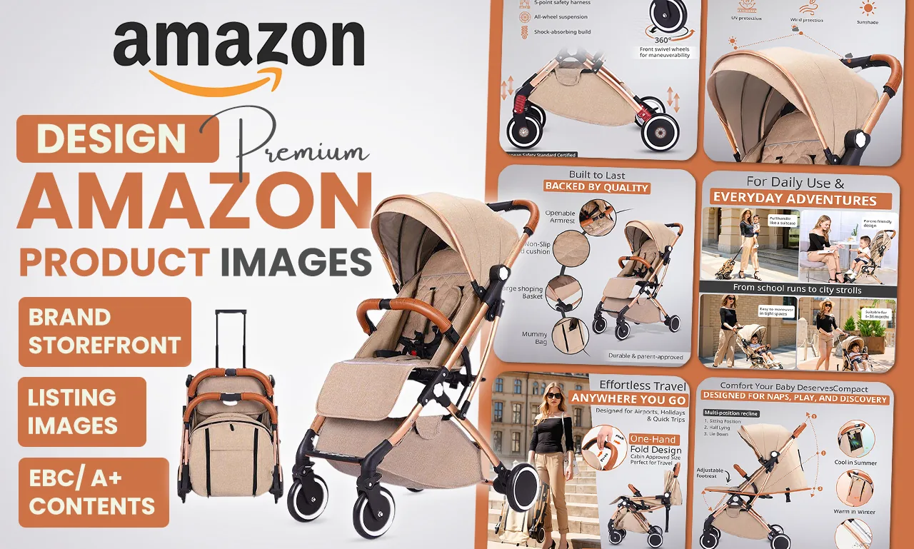
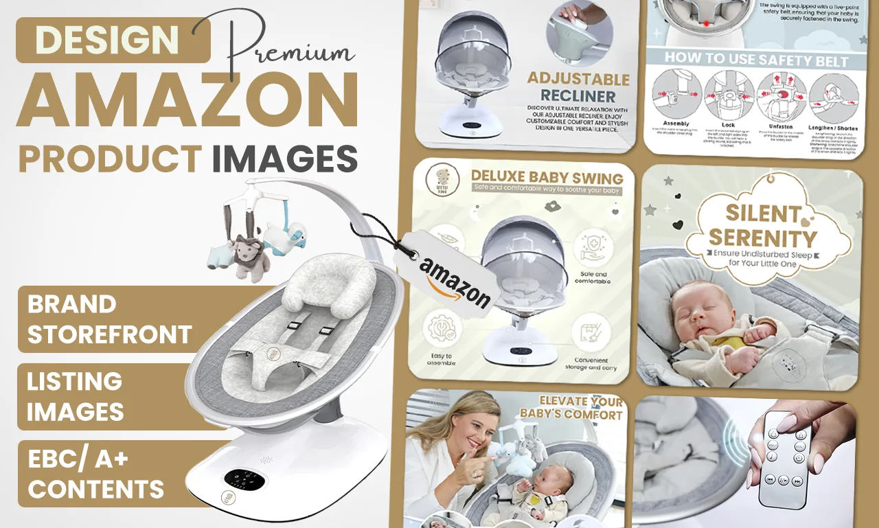
The rest of the modules do the work the gallery could not fit: how it works shown rather than claimed, specifications and sizing, what is in the box, and the use cases that are not obvious from the product photo.
Premium A+, and the mobile trap
Premium A+ adds larger modules, video, hover hotspots and comparison carousels. Whether it is worth it depends on your product: it earns its keep where the thing genuinely needs demonstrating, and changes very little on a product a shopper already understands. We wrote the honest comparison in A+ vs Premium A+.
The trap in both is mobile. Modules reflow on a phone — multi-column layouts stack, and text baked into a wide image shrinks with it until it cannot be read. Design that ignores this produces modules that look excellent in the Seller Central preview and are illegible for most of the people who see them.
So text that matters goes in the module's own text fields rather than inside the image wherever the layout allows it. It stays readable at any width, and Amazon can index it.
One more thing worth deciding early: A+ sells this product, Brand Story sells the brand across every listing you own. Product-specific content in Brand Story is wrong on most of the pages it appears on — the difference is here.