How to Design an Amazon Storefront That Isn't Just a Catalogue
Most Brand Stores are a homepage with every product dumped onto it. That is not a store, it is a shelf — and it wastes the one place on Amazon where you decide the layout instead of filling in a form. The stores that earn their build are organised around how the buyer already thinks.
Know what the store is actually for
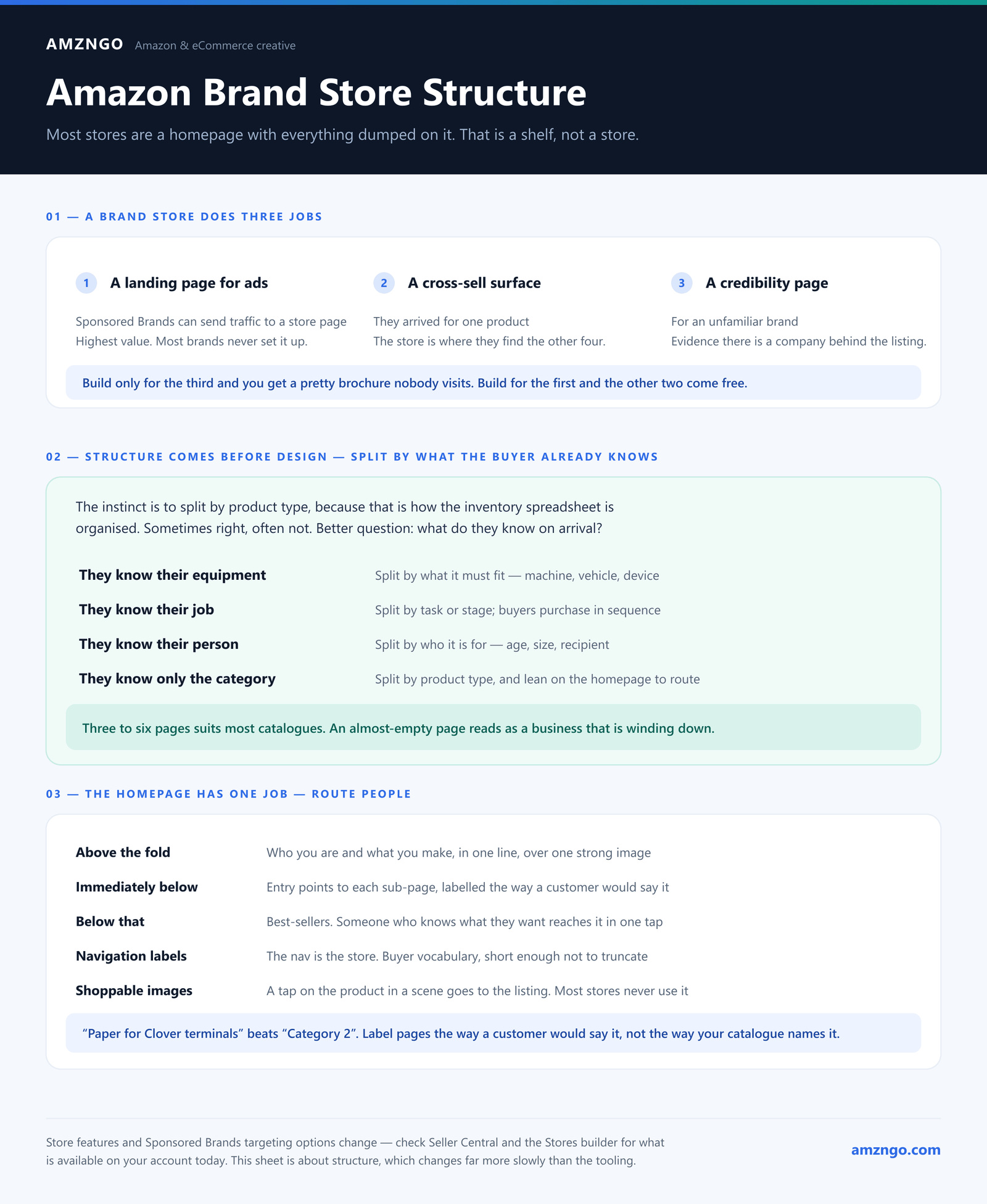
A Brand Store does three jobs, and they pull in different directions if you do not decide which matters most:
- A landing page for ads. Sponsored Brands campaigns can send traffic to a store page rather than a product listing. This is the highest-value job and the one most brands never set up.
- A cross-sell surface. Someone arrived for one product; the store is where they discover you make four others they also need.
- A credibility page. For an unfamiliar brand, a considered store is evidence there is a company behind the listing.
If you build only for the third, you get a pretty brochure nobody visits. Build for the first and the other two come free.
Structure comes before design
The single decision that determines whether a store works is what the pages are. Get that wrong and no amount of design rescues it.
The instinct is to split by product type, because that is how your inventory spreadsheet is organised. Sometimes that is right. Often it is not. The better question: what does the buyer already know when they arrive?
- They know their equipment. Split by what the product must fit — machine brand, vehicle model, device. A shopper who owns a specific terminal wants a page about that terminal, not a grid of everything you sell.
- They know their job. Split by task or stage. Someone repairing something buys in sequence, so the page order should follow the sequence.
- They know their person. Split by who it is for — age, size, recipient. Common in gifts and anything for children.
- They know only the category. Then split by product type, and lean on the homepage to route them.
Three to six pages suits most catalogues. More pages than you have products to fill is worse than fewer — an almost-empty page reads as a business that is winding down.
The homepage has one job
Route people. Not sell everything.
Above the fold: who you are and what you make, in one line, over one strong image. Immediately below: clear entry points to each sub-page, labelled the way a customer would say it, not the way your catalogue names it. "Paper for Clover terminals" beats "Category 2".
Best-sellers go below that, not above. Someone who arrived knowing what they want should reach it in one tap; someone browsing will scroll anyway.
Design decisions that matter more than they look like they should
Navigation labels
The nav is the store. Labels should use the buyer's vocabulary — the words they would type — and stay short enough not to truncate on a phone. This is worth more thought than any image on the page.
Shoppable images
Amazon lets you make lifestyle images shoppable, so a tap on the product in a scene goes to the listing. Most stores never use it, and it converts far better than a lifestyle image with a separate product grid underneath.
Consistency with your listings
If the store looks like a different brand from the product pages, the store is doing damage. One visual system across store, listings, A+ and Brand Story is what makes a small seller read as an established one.
Mobile first, genuinely
Most store traffic is in the app. Wide banners crop, small caption text vanishes, and multi-column layouts stack in an order you did not choose. Preview every page on a phone before publishing — the Store builder has a mobile preview and it should be the view you design in, not the one you check at the end.
Wire it to your ads, or skip the build
This is the part that turns a store from decoration into a channel. Sponsored Brands lets you choose the landing page. If a campaign is bidding on terms about one product family, it should land on the page about that family — not the store homepage, and not a product listing where the shopper sees one option.
A store with brand-specific or category-specific pages exists so that ad traffic can be routed by intent. Building the pages and then sending every campaign to the homepage wastes most of the value.
Then actually look at the data
Amazon gives store-level insights: visitors, views, sales and units per page, broken down by traffic source. Almost nobody reads them. They will tell you which page earns its place, which one nobody reaches, and whether the ad traffic you are paying for is going somewhere that converts.
A store is not a launch-and-forget asset. Check it after a month and cut the page nobody visits.
The short checklist
- Pages split by how the buyer thinks, not how your inventory is filed
- Three to six pages, each with enough products to look alive
- Homepage routes rather than sells
- Nav labels in the customer's words, short enough for mobile
- Shoppable lifestyle images wherever there is a lifestyle image
- Same visual system as your listings and A+
- Every page checked on a phone
- Sponsored Brands campaigns pointed at the matching page
- Insights reviewed after a month
Want a store built around your buyers?
Tell us what you sell and what your customers already know when they arrive. We'll sketch the page structure before anyone designs anything.
Start a projectMore on Amazon storefront design, Brand Story and our case studies.