



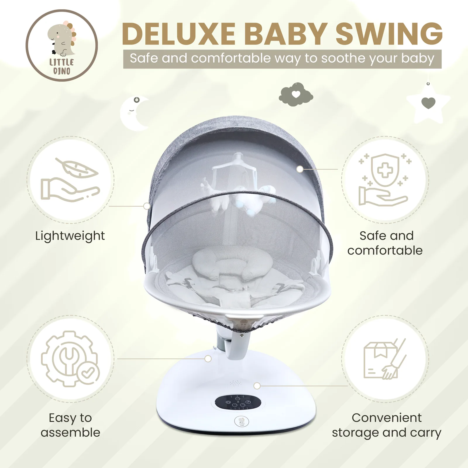
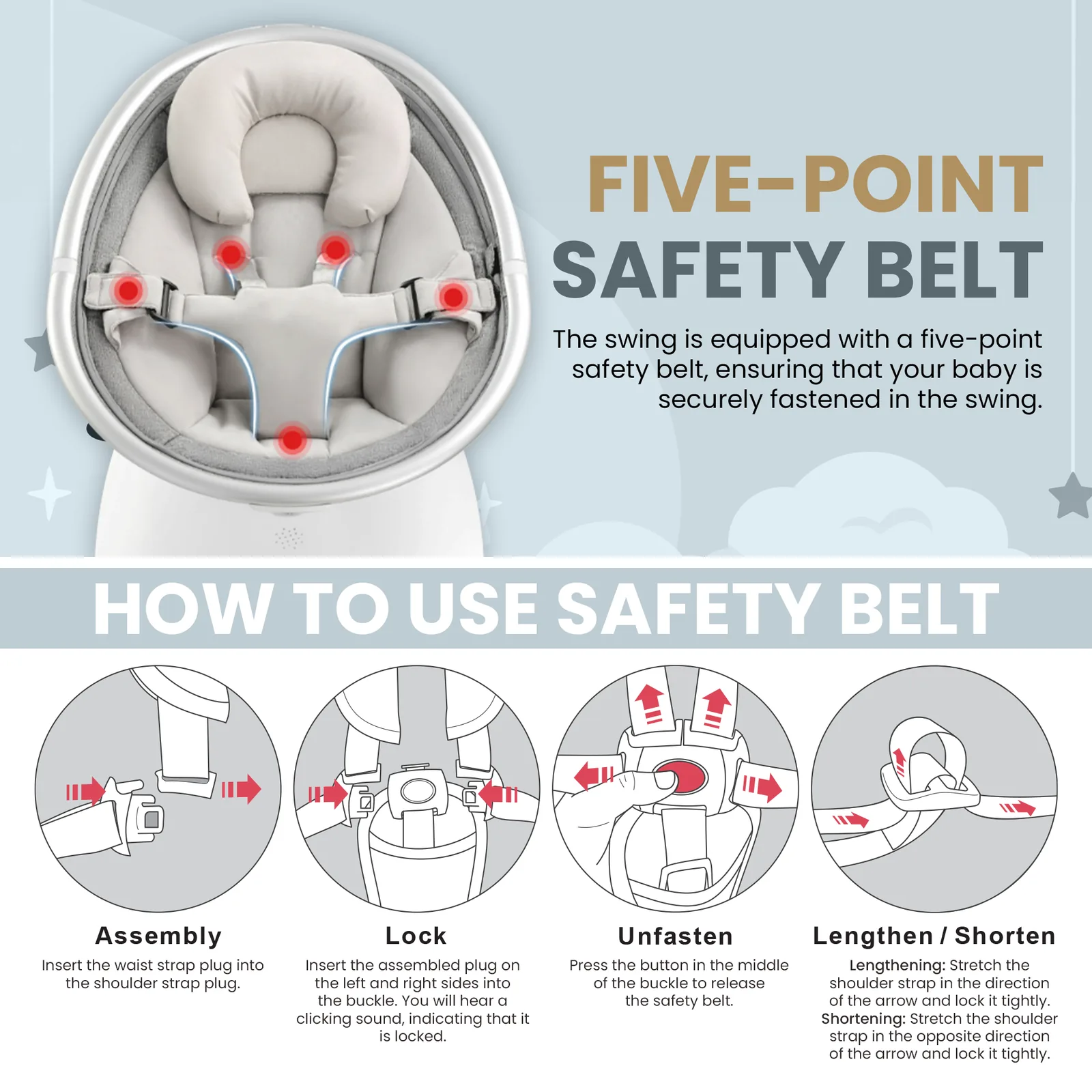





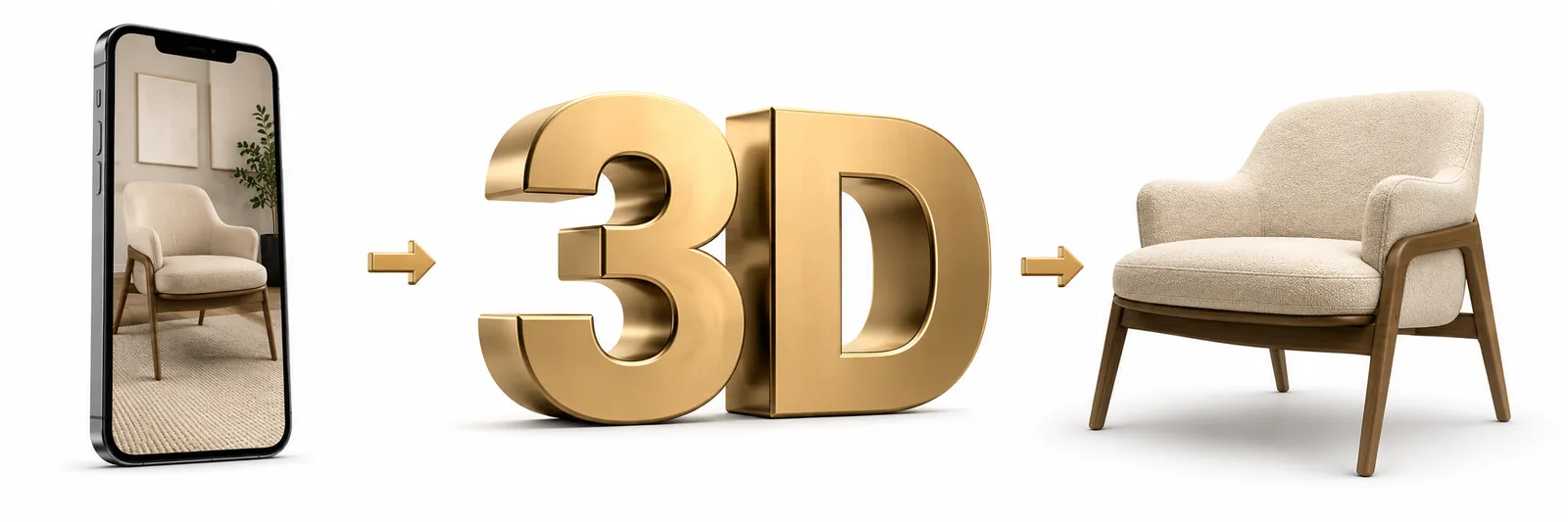












The gallery is a sequence, not a set
Seven images uploaded in the order they came out of the folder is the most common way a good photoshoot is wasted. People swipe in order and they stop as soon as they have decided — so the sequence is the design, and the question is what they need to know next at each step.
The order that works, in almost every category: hero, then what it actually is at a glance, then the feature that separates it from the cheaper option, then the objection that stops the sale, then scale, then what is in the box, then the lifestyle shot. The objection slot is the one most listings skip and the one that earns its place — fit, compatibility, assembly, safety, whether it works with the thing they already own.
You can find yours without guessing. It is in your negative reviews, in the questions on the listing, and in the pre-sale messages your support inbox already gets. We ask for those before designing, because a made-up objection wastes a slot.
The main image is a different job from the rest
It is the only image judged against competitors rather than on its own, and it is judged at roughly the size of a postage stamp. That makes it a silhouette problem before it is a photography problem — a shopper scanning the grid registers shape and colour long before they read anything.
It is also the one with rules. Pure white background, the product filling most of the frame, no added text, no logos, no props that are not in the box. Sellers lose listings over that last one. The full spec, including the parts that trip people up, is in our image requirements guide.
Everything after the main image is unrestricted. That is where text, callouts, comparison and context belong — and packing them into the main image because you want them seen sooner is how a listing gets suppressed.
Assume a phone, in bad light, at speed
Most of your gallery is viewed on a phone, often at thumbnail size, frequently one-handed on the move. A layout designed on a 27-inch monitor and approved on a 27-inch monitor routinely turns into unreadable grey text once it is 180 pixels wide.
So we check every asset at the size it will actually be seen: minimum type sizes, contrast that survives a dim screen, one idea per image rather than four, and callouts positioned so a thumb does not cover the important one. This costs nothing to do and is skipped almost universally.
It also changes the copy. A phrase that reads well at full width has to survive being cut to four words. If a benefit cannot be made legible at thumbnail size, it belongs in A+ content, where there is room for it — not squeezed into a gallery image where nobody will read it.